 For this new project I bought a collection of fat quarters from the Harmony fabric line by Sweetwater. I love to start a new project, and I love to open a new bundle of fat quarters!
Love 💕 love 💗 love💖
We are not going to talk about the fact that my version of the first Blockheads project has not been completed, nor the fact that I said I was not going to start the new one until the old one was finished.

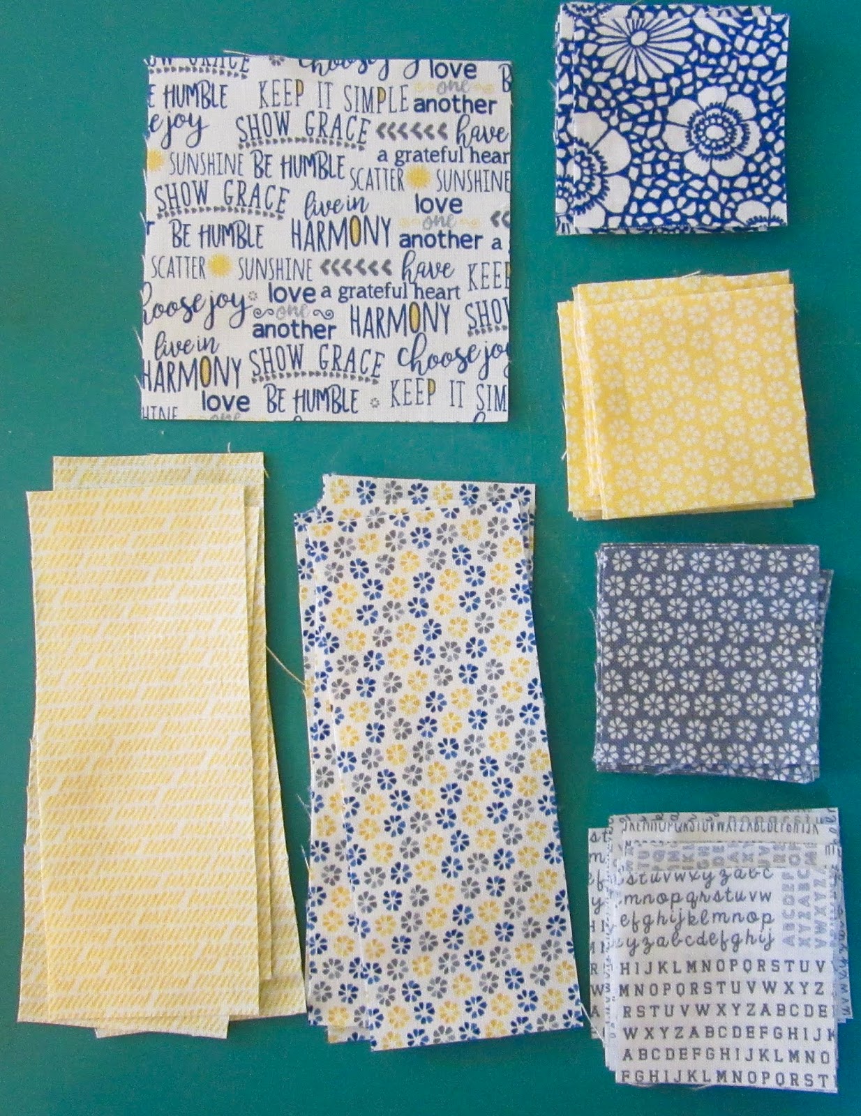
I was wrong about my self control and once I saw the first block pattern posted, I immediately opened up the bundle and grabbed the rotary cutter. When I spread all the fabric out I wondered if I was going to have a problem with the lack of contrast. The values mostly read from light medium to dark medium.
Hmmm what to do?
I went ahead anyway and was so happy cutting up the little pieces and sewing them back together. My favourites are the text prints and the sunshiny yellows.
Here is my Stellar Star block.

I was disappointed to see how it turned out. After all that time and excitement, to not really like the end product is just... ugh.
Do you see what I mean about not enough contrast? What do I need to add in order to improve this fabric collection to make future blocks more appealing.
Add in some dark tone on tones? Use a pure white for the light, the lights for mediums and the mediums for darks? All ideas are welcome :)
Linking up to Sew Fresh Quilts.
22 comments:
Such a pretty block but I see what you mean about more contrast needed....how about adding some solid white and/or solid darker blue? How about a dark background to make those lighter colours pop? ...
A good lesson to remember when trying to use just a FQ stack from a fabric line. Often the fabrics are medium values, and a few lights, with one or maybe two darks. Looking at the photo of this line, that is the case here as well as scale of prints are all the same. Adding one good dark will cure this like the above comment said. A strong dark would make it all pop:)
I agree, it needs a dark most, but you might be happiest adding both a very light and a deep dark. The whole bundle is low volume, with very little contrast in print or value.
It's a lovely block, but does need more contrast. I think I would add white and darker solids in gray, blue and yellow.
The cozy quilter's idea of a dark background would make all your colours pop. I do like the text fabric but the white one has text going in different directions which is confusing in the block...looks like two pieces when it is only one. So maybe an addition of a tone on tone white would work too!Hope you figure it out with all these suggestions from everyone.
The collection as it is is fine - it will result in a softer, washed out look, but if you want to make it pop, I would add darker blues.
I think your block is very pretty. Some dark tones would probably make the colors pop, and I like the idea of using a dark background.
Here's my two cents....if you aren't happy now, change it before you have anymore time invested. I recently almost finished an entire applique block before I admitted it wasn't working. Started fresh, and am so much happy😊😊
I kind of like the softness of the colors, but like everyone else...a darker blue would be a wonderful addition!
I agree with Sandra, change it now while it is less painful. Even if we all like it, there is something that isn't appealing to your inner you. Maybe add a bigger print? or a darker print? I never say no to white even when I should so not going there.
I had the same concerns for the fabric line I chose, which is mostly mediums with a light. I don't usually limit myself to one line nor one manufacturer, but I thought I'd try to keep this one all Moda and from stash. However, I really am itching to replace my star points with a darker color. I'll probably wait until the end to decide whether to remake anything. Usually when all the blocks get together, I don't mind the shortcomings of a few, and if I'm really not happy at the end, it'll become our new picnic quilt. :)
I like the quietness of the block - sometimes high contrast is jarring. Your piecing is lovely. I went on the Moda site and found that many of their samples didn't have much contrast either. Perhaps you could make another and add more contrast to that one as this one is so beautifully done!
Hmmm. Lots of lights in the bundle... I would add least a few FQ's each of the darker shades in solid or reads solid in charcoal greys to black, yellow to gold, blues even to navy or the color in that blue dot on the upper right. That would add some dark options as you make your blocks. Good luck.
I really like this block design, but the intricacies of it do kind of fade with the low contrast fabrics. I would take either the blue or grey to the dark end of the scale--maybe even both.
Seems like most everyone agrees that you need more dark fabric (and I like the addition of a plainer looking white). For me, I would have made the star points in a dark that looked more solid. The bundle is all very small prints. I like different scale of prints from light to very dark and not all exceptionally busy. I like the idea of a dark navy more solid looking and the grey idea appeals to me also. But in the end, it is your block and your quilt. What makes you happy is what counts.
I did a block of the month in pastels, even though I did not like the pastels, to work outside my comfort zone. I didn't like the blocks. But I made 20 blocks. I picked a much darker shade of one of the pastel colors for my sashing, and incorporated the pastels in the corner stones.
I absolutely love how the quilt turned out. The dark sashing frames all the blocks, but your eye zooms in to examine the low volume blocks to admire them. I couldn't believe how much I liked the quilt even though I didn't like the blocks when making them.
Just my past experience of working outside my comfort zone.
I would add red.
I think buying a pure white and a solid dark blue would be a great idea. And while it's great to think in terms of contrast, but don't forget to think in terms of color, too! You have yellow and blue-- and you are using them both in the different patches. You could have made the checkerboards in just yellows, and the flower center in just blues-- that would have helped distinguish them. All this aside-- your block is lovely-- every quilt does not have to go from 0 to 10 on the contrast scale-- softer is fine! xox
Not being a quilter (have made quilts...but not real ones/) but seeing this as yarn...I think it's in need of some dark to make the yellow's pop. I had to laugh reading your words saying we're not going to talk about starting something when other things aren't finished. I do that all the time with my yarn, I call it start-itest. I love yellow though so don't think your block needs much to make it gorgeous.
Sandy's Space
I'm with Cathy - I would add red. Or maybe (even more likely, since it's me) orange.
Go with what your heart tells you. If you're not happy now, you won't be later either...
I agree with the others who suggest a darker tome of the Blue and/or gray. Pretty block. Maybe even one darker yellow/gold.
A great bundle and block, I'll be a record and repeat to add white and something dark.
Post a Comment