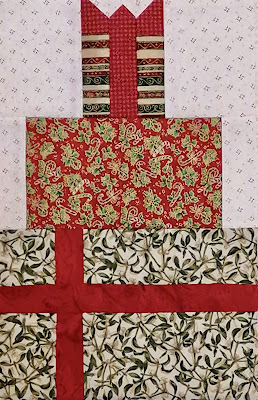
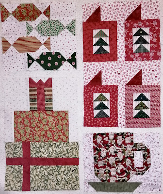
Here are all the blocks together on the design wall. This is layout #1.
The candy and presents have to be in the same column and the cards and Santa mug have to be in the same column (due to size).
Here is layout #2.
Do you think it looks more balanced with the mug on the top and cards on the bottom?
It's time to cut some sashing and border strips, and turn this into a quilt top.
Linking this post to Design Wall Monday at Judy's


I like layout #2. The balance seems better. These look like fun blocks.
ReplyDeleteLayout #1 is more balanced, Layout #2 is more grounded. Not a lot of help, I know. I slightly prefer #2. But both look good.
ReplyDeleteOh so pretty! I was going to join in but of course as I am traveling I couldn't.. might catch up when I get home. I like layout #2 better as well! xx
ReplyDeleteLayout #2. The cards on top of the mug in layout 1 look like they might tumble over.
ReplyDeletePat
I think the 2nd option makes the presents look tooo smal. I like the 1stoption.
ReplyDeleteI really prefer the coffee cup on the bottom. It looks more balanced. BTW yours are the best cards I’ve seen
ReplyDeleteI really like your fabric choices for this one. Either layout works, but I think I like #1 best. I have the instructions for this little mystery saved but haven't attempted it yet.
ReplyDeleteBoth layouts are nice but I prefer the cards on top. Which, by the way, your cards actually do look like cards. I've seen some others' blocks that the fabrics don't really work well and you can't tell what they are supposed to be. That's a tough pattern to make work, I think. Good job.
ReplyDeleteSuch a cute quilt! These are amazing blocks. I’m really not sure which layout I like best.
ReplyDeleteHi Kathy, it looks great. I like layout #2 best. Have a great week!
ReplyDeleteNice blocks and such pretty fabrics. Looks good with the cards below the mug. What did you end up doing?
ReplyDelete