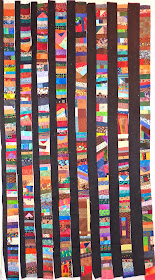
On the design wall today are my treadled scraps.
There are twice as many columns as are placed on the wall at the moment.
All the scrap strips are sewn to a black strip, and am trying to get a sense of whether I will like this, or need to change it up.
It seems dark to me.
Maybe I should not use this many wide black strips?
For sure I need to take the vertical strip of yellow out of there!
Do you have any layout suggestions for me?
To see more design wall postings, hop over to Patchwork Times.

maybe you could alternate a black strip and then a blue strip then black again or black, red, black, red…
ReplyDeleteI do like it though I thin the black grounds all whats going on! Another suggestion would be to sew the strips together to make them wider then a skinny black strip. you will figure it out! keep going
Kathie
I think you need to stay with skinny black strips, but have you thought of doing a couple of horizontal rows at the top, then the coin rows and then horizontal again at the bottom?
ReplyDeleteAre the black strips already sewn own? If they are and you want to brighten it up, maybe you could sew another strip of a light color on it also, like white, yellow, pink or something, or you could just sew them all together and add a light colored border that would brighten it up.
ReplyDeleteTry inserting an occasional "light" vertical between two dark ones - random, a bit surprising, and brighter ... The scraps themselves are wonderful! ( light could be red, brighter blue, a green or gold/yellow, or even black and white)
ReplyDeleteVertical yellow is like a "blinking beacon" to quote the Christmas Rudolph movie!!! and I think you are right the thicker black strips are too wide... I like the skinny ones much better. I think if you keep the black in proportion to the coloured ones, it will look great and have the right brightness!
ReplyDeleteI kind of like the idea of the skinny solid colored strips between two black ones to create your sashing. But then, I don't have a problem with the way it is now, either! : )
ReplyDeleteLooking good as you have it! I kinda like the skinny black strips between the columns best if I must choose. Regardless, I'm interested in how this turns out as I an accumulating lots of small pieces of fabric ideal for scrappy columns like the ones you pieced.
ReplyDeleteI think what you are reacting to is how predictable your design wall layout is. Bright colour strips followed by ever wider black strips. What if you changed up the black strip placement so it wasn't so predictable - more random? What if you slashed some of your bright strips and inserted a bit of black where the colour is and something bright or white or gray where the black is? What if you had bright strip, black strip, coloured strip, black strip, bright strip? I agree with previous replies that the two widest bits of black are a little too wide. Whatever you come up with, I'm sure it will be just the right thing.
ReplyDeleteSkinny strips or no sashing strips has my vote!
ReplyDeleteI like the skinny black strips, but you should do what pleases you. Love that you did these on your treadle! You go girl!
ReplyDeleteI love all the scrappiness! But I think you are right in cutting down on the width of the thicker black strips. I'd keep them all narrow like the thinner ones, and perhaps add a bright yellow here and there - taking out that vertical strip of course :)
ReplyDeletelove the black strips, black really makes the colours pop, maybe they could be a little narrower though
ReplyDeleteI like the skinny strips, but then your quilt reminds me of this quilt that I made (mumble) years ago
ReplyDeletehttp://www.thequiltery.blogspot.co.nz/2007/04/borders.html
... and am just finishing the binding on now. I took it away with me to the beach just the other week and it was such fun to sleep under. The black really defines the colours and makes them pop.
If you stick with the graduating widths do you think they need to increase in in width more slowly across the quilt?
Hola, yo estrecharia las tiras negras,
ReplyDeletey las cortaria a una cierta distancia e invertirlas...bsbs
Everyone already has so many great ideas for you. My comment comes from the, "if these were mine," mindset. If, like me, you have a stash of orphan blocks, I would build some (wider) strips from those orphans and mix in a couple of them with your treadled strips, keeping the black strips in-between.
ReplyDeleteNow, see? I like the way that the sashings are gradually larger as you move across the quilt :-) It would look pretty darned spiffy if you were to add your remaining strips to the left side (with the narrowest sashing) and graduate the sashings larger as you've already done. Especially if you don't have as many strips to add to the left side. I think it would take it from a lovely scrap quilt to almost an art quilt, with the hint of optical illusion from the graduated sashing sizes.
ReplyDeleteI like the graduated black strips, but I also like dark quilts, so that may not work for you. Love all those bright spots of color.
ReplyDelete