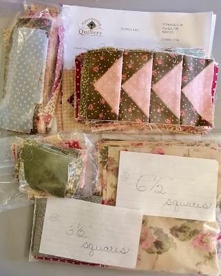
My friend Judy gifted me with a bag of fabric from cleaning/purging her sewing room. This was a project she started in a class many years ago and over time lost interest in it. I'm guessing it's about 20 years old? For those of you who are local, it dates back to the original Greenwood Quiltery location on Suffolk, so that's a long time ago!
Judy's piecing has always been meticulous and she is very organized as you can see. She has everything labelled and even stored the pattern with the fabric!
It was easy to pick up right where she left off. However, I didn't want to make the original pattern design which would require a lot of seam matching. This is an example of a block in the original design.
 |
| New block and old pattern |
That was way too much seam matching for me. So I made a slight alteration and instead of the flying geese going all the way around the square, the geese are going to be only on 2 sides. See the old graphic for the original design at the bottom of the handout?
Here are the blocks I've sewn so far on the design wall.


So pretty! This is older Robyn Pandolph fabric. Those of you who have been quilting a long time will remember this.
That red square really stands out so I either need to take it out, or add more red in. What would you do?
Linking up to Design Wall Monday


Guess I have been quilting for too long. Not only do I remember Robin but I have some of that green/brown fabric in my stash. I loved it and have some fat quarters to use up.
ReplyDeleteAdd more red, you have some in the geese, so just add a few more squares as you make more blocks.
ReplyDeletePut more red in! :) (P.S. That's really pretty!)
ReplyDeleteI used to have a lot of those little prints - no more! more red as others say would look great if you have it
ReplyDeleteMany moons ago, Robyn Pandolph was a speaker at the guild I belonged to. I took a workshop with her on appliqué...I never did finish the project but learned a lot in the workshop. I am undecided about the red...
ReplyDeleteI definitely recall that fabric line..I know I had that roses print for sure.
ReplyDeleteI would add more red..have fun...
hugs, Julierose
I'll be the contrary one and say take the red square out. But just to be sure, try it both ways and see which you prefer.
ReplyDeletePat
Definitely add more red.
ReplyDeleteLove how you changed the block! Definitely add more red - its the "surprise" in the quilt with it being sprinkled throughout. Deb E
ReplyDeleteI think the red square should be taken out. That being a larger dark piece in the sashing seems to stop the eye -- while the scattered red geese seem to keep the eye moving.
ReplyDeleteDoes anyone know what has happened to Robyn? She was always one of my favorites and she has disappeared from the fabric scene.
ReplyDeleteI agree with ebwhite by removing the red square. It will be a nice quilt when finished.
ReplyDeleteyou could do the binding in red... I would leave the red alone that you have already sewed...
ReplyDeleteI would leave the red as is. That "punch" of red comes through in some of the prints. Make sure that it's will distributed and it's a go. Love the fabrics and your change to the pattern looks great.
ReplyDeleteI'm with the minority and say take it out, as it really jumps out at you. The red flying geese are fine and not so in your face. But..... of course, it's up to you!
ReplyDeleteI remember that name too. I’d take the square out. The red in the geese aren’t screaming “red” so they’re fine.
ReplyDeleteYes, I remember Robyn Pandolph. I believe I have a feathered star UFO in a cupboard somewhere made from one of her lovely florals.
ReplyDeleteI think the red geese give the red cornerstone a reason for being there, but only if it is not the only one.
I like where you are going with these units.
I'll bet you were thrilled with the efficient organization of the parts. :)
I’d add more red! I love the way it looks. I remember Robyn Pandolph, her fabric at that time was some of my favorite. Hugs,
ReplyDeleteI would add more red! And I love this design, geese being one of my faves. Can't wait to see the final final!
ReplyDeleteThanks for reminding me of Greenwood Quiltery. Had some wonderful times and learned a lot from great instructors, including you. Dianne Cook
ReplyDeleteYour changes to this pattern are inspired! The red gives a little pop to the overall look so a little more here and there would work, I think. But don't mind me, I'm terrible at these decisions. Those fabrics, while old, are so pretty. I love everything you sew, Kathy.
ReplyDeleteLove the change you've made to the pattern. I would take the red block out but leave the red flying geese (and I love red!)
ReplyDeleteA perfect redesign!
ReplyDelete