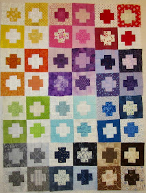
Four more 3" Economy Path blocks were made this week (pattern here). This was one of my favourite 2019 Rainbow Scrap Challenge projects. During the months of November and December we are encouraged to finish up our RSC projects. It's time to turn these blocks into a finished quilt!
 |
| Layout A |
Can I ask for your help in picking the layout?
Each of these 3 layouts has a slightly different colour arrangement.
I tell myself "there are no wrong answers", and truly I do like them all!
 |
| Layout B |
Oh shoot I have the grey blocks turned incorrectly... ignore that!
I like this layout also but does it make the aqua blocks stand out a bit too much?
 |
| Layout C |
Please help me decide by voting on your favourite layout in the comment section. Final decision will be made after a tally of your votes and I'll try to get it finished by next week.
Happy Scrappy Saturday!
Linking up to the weekly RSC party.
Prefer c
ReplyDeleteI also prefer C.
ReplyDeleteDitto, I like C.
ReplyDeleteB or C for me. Your blocks look great together!
ReplyDeleteI'd like to see Layout D, please. Take Layout C and switch the purple in the center for the yellow in the upper left. It might make the resulting quilt seem to glow from within.
ReplyDeleteOh, scrappy quilts are so hard for me to decide. I like set C because the progression of the fabrics are rainbow like with the lower right side of the quilt being "grounded" for my eyes. Good luck choosing.
ReplyDeleteConnie
I would say c for your cute blocks
ReplyDeleteLayout A
ReplyDeleteHmmm. You have the bright orange, lime, yellow and light blue next to each other in all layouts..... maybe spread those 4 around the quilt? Sorry, i dont follow directions well :)
ReplyDeleteLayouts are always such a tough decision! I think I like C. I really like those blocks - they're on my list for next year!
ReplyDeleteHow about the lights in the center and radiate out to the darks?
ReplyDeleteI like version C.
ReplyDeleteArrangement C does please my eye more, but I am curious to see a layout with the lights and darks just mixed up helter-skelter.
ReplyDeleteAnother vote for C!
ReplyDeleteSuch fun blocks!! You are right, all the layouts work!! C is my fave!!!!
ReplyDeleteCan I throw a wrench in there? What if you rotate every other block one quarter turn? I mean to have the light with the light and the dark with the dark. It could make an interesting secondary pattern. Just saying. Love what you got in A. Enjoy the dithering. ;^)
ReplyDeleteLike all of the colours, but my favourite is layout 'C'.
ReplyDeleteAt first I like A better but after having a better look, will go with C!
ReplyDeleteYeah, I like C the best. But there may be other options. It will be beautiful and fun, whichever you choose.
ReplyDeleteI prefer C.
ReplyDeleteI like C, but whichever one you choose will be a great quilt!
ReplyDeleteI like C best. They are all pretty though.
ReplyDeleteLayout B is my choice, Kathy.
ReplyDeleteI don't think you can go wrong with any of them. They are all beautiful!
ReplyDeleteB
ReplyDeleteI'm going with B. Just like the arrangement of colors. Great work!
ReplyDeleteC
ReplyDeleteNo doubt my choice is C. Seems to be a calming layout going from light to dark!
ReplyDeleteI really like C the best. It has a cascading effect that I like the best.
ReplyDeleteHmm, I really liked layout A the best. Anyway it ends up will look great on a bed. Such a simple block and easily uses up scraps to boot, what's not to like? Next on my list to do.
ReplyDeleteI like C, but they are all cute!
ReplyDeleteI think any of them would work, but I like B the best. And I'll second trying a layout D with the lightest colors in the center and the darker ones around the edges. :)
ReplyDeleteVery nice! I think C is my favorite.
ReplyDeleteI just love all your tiny blocks!
ReplyDeleteAll beautiful but I favor Layout C. Seems more balanced to my eyes.
ReplyDeleteI vote for C.
ReplyDelete